
Rethinking Frisbee
For this set of advertisements, the goal was to use the psychology of marketing to create creative and appealing ads. The targeted tactics were reciprocity, authority, humor, fear, beauty, and words. Combining my interactive illustrations with digital photography gives an even more playful and friendly approach to the Frisbee corporation.
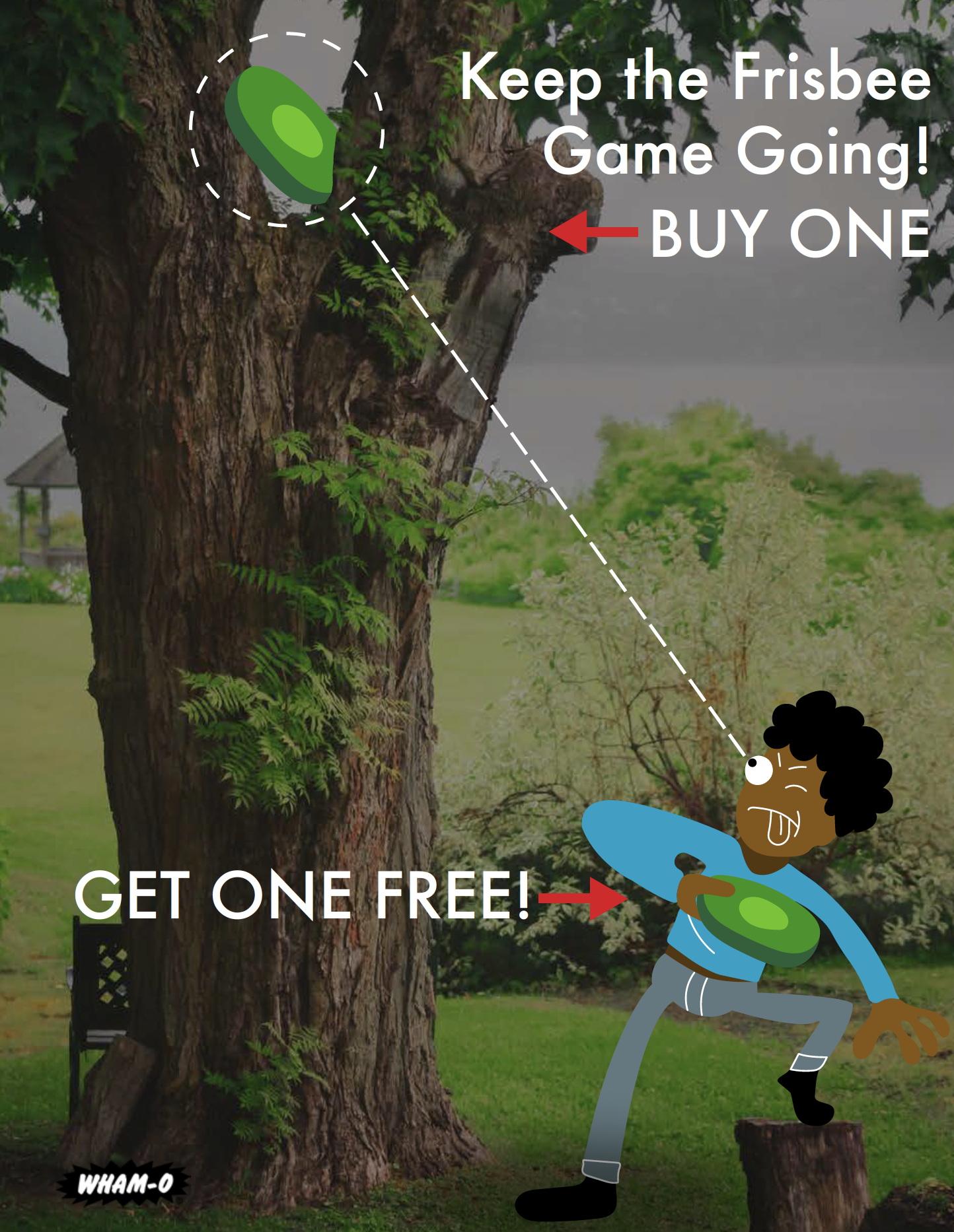
Reciprocity: BOGO with a twist. I wanted to focus less on the seller's objective to sell another frisbee and more on why a consumer would need to purchase two frisbees. I landed on the very relatable feeling of getting a frisbee stuck in a tree. If you have two the game can go uninterrupted!
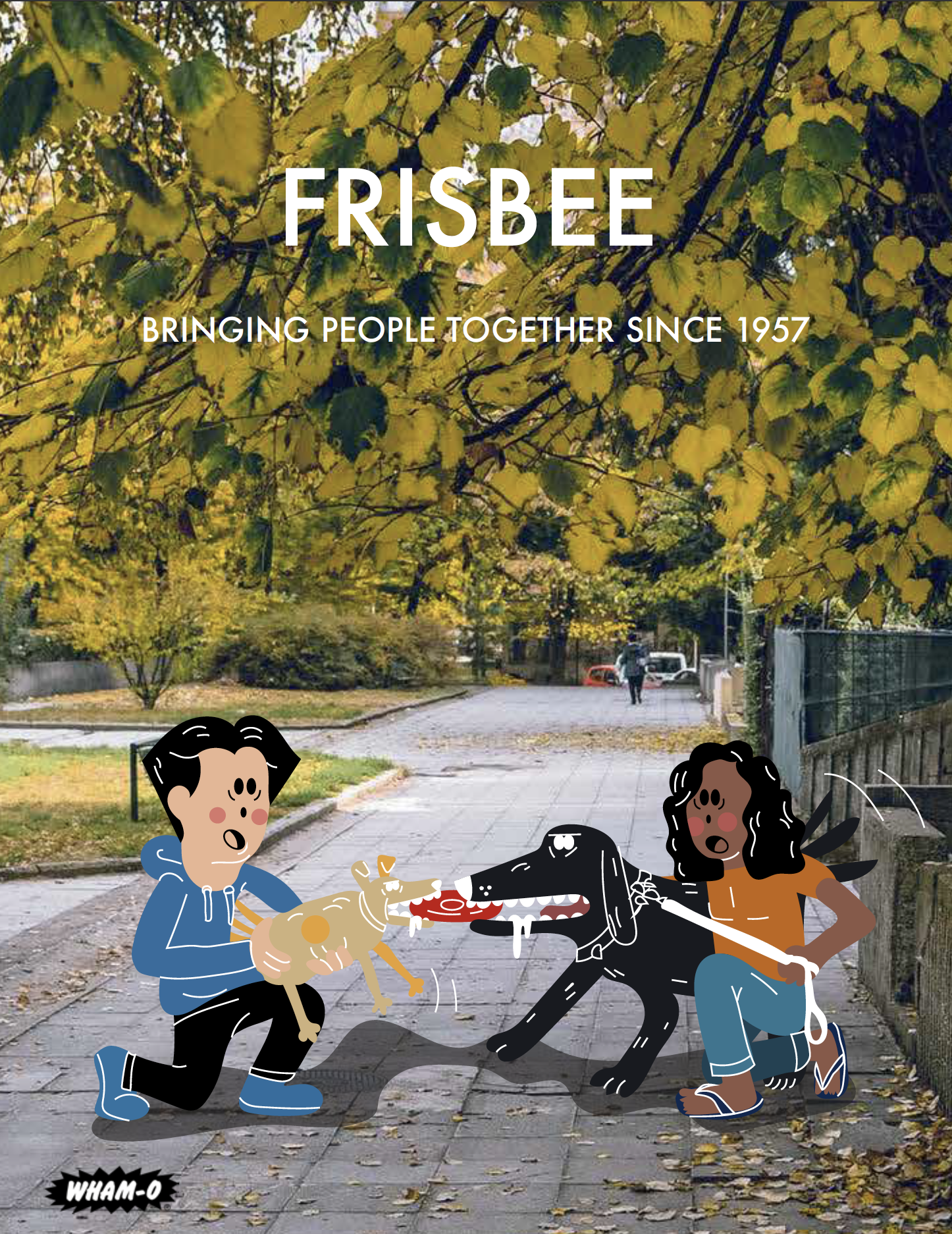
Authority: I wanted to veer away from the typical tropes of using someone of power or influence such as a doctor or celebrity and instead highlight how long the Frisbee corporation has been in business. Reading that they have been serving their customers since 1957 speaks to their validity and authority just as well.
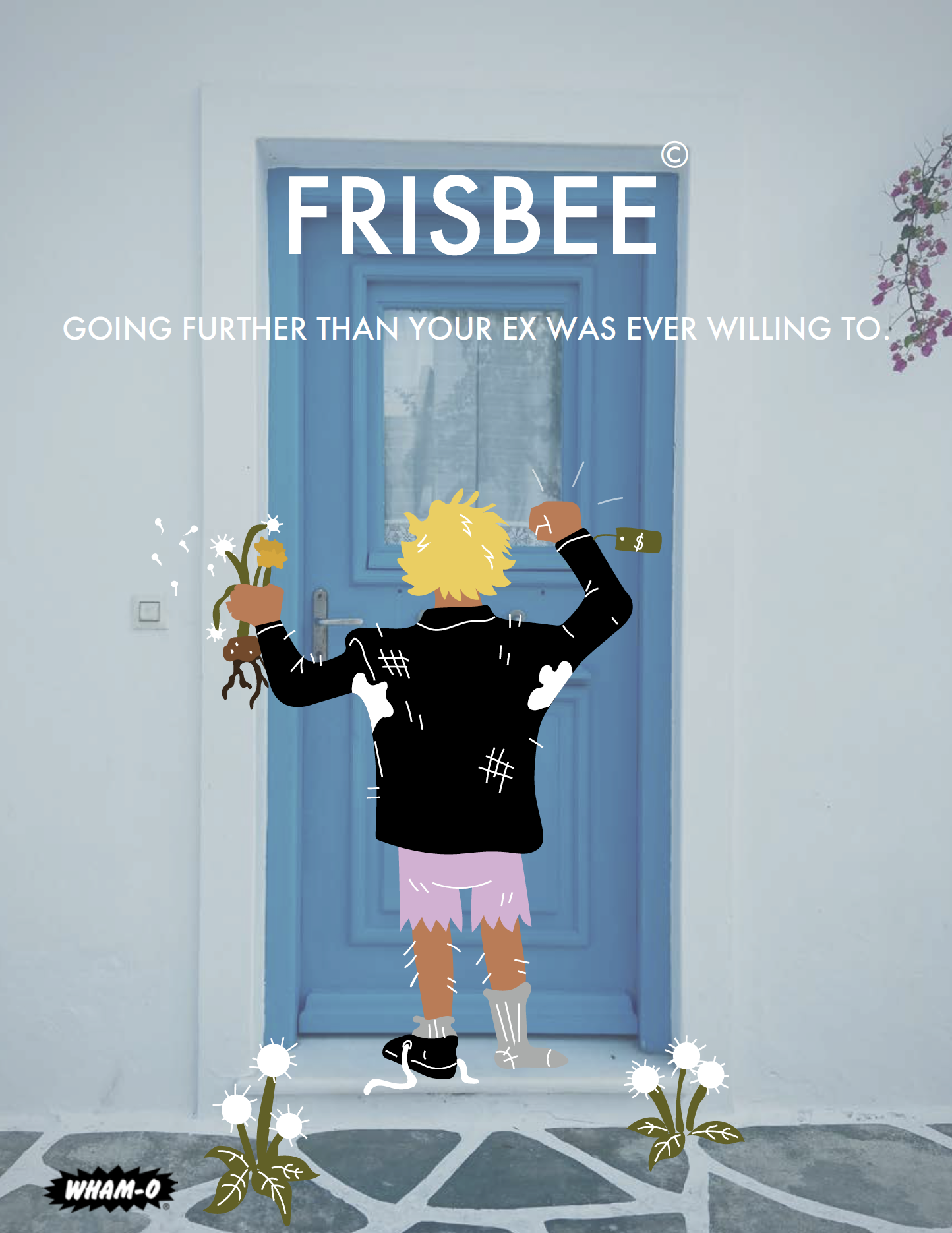
Humor: Ads that can make someone laugh are powerful. I enjoy adding humor in all of my ads but this one was specially made to persuade the consumer to purchase using humor. Again I used relatability, people want to see themselves in Ads. We all have had the displeasure of knowing someone personally or through someone else the Ex character of this ad and can collectively roll our eyes.
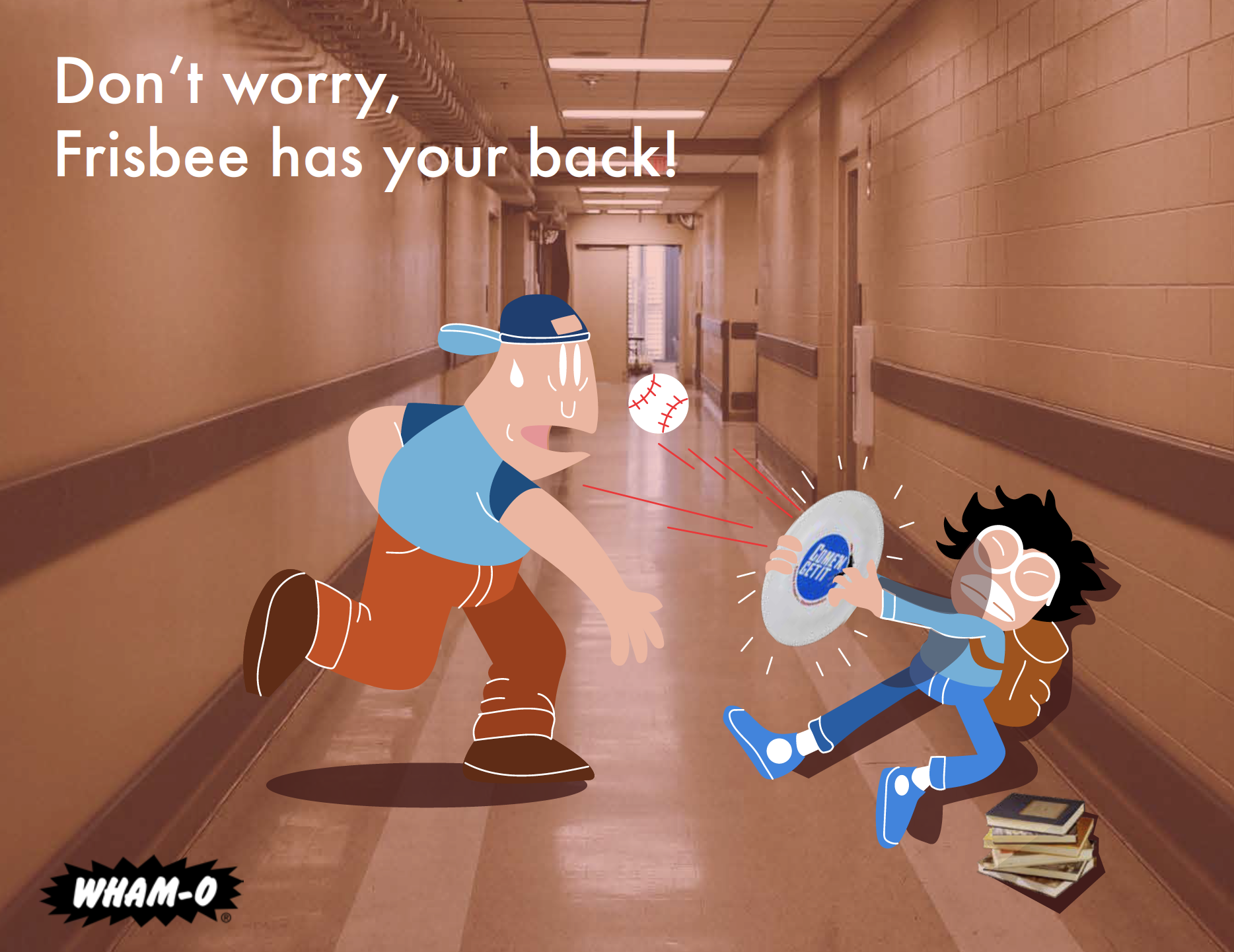
Fear: Evoking fear with frisbees can be difficult but not impossible. This Ad strategically takes a fearful situation and offers comfort and support.
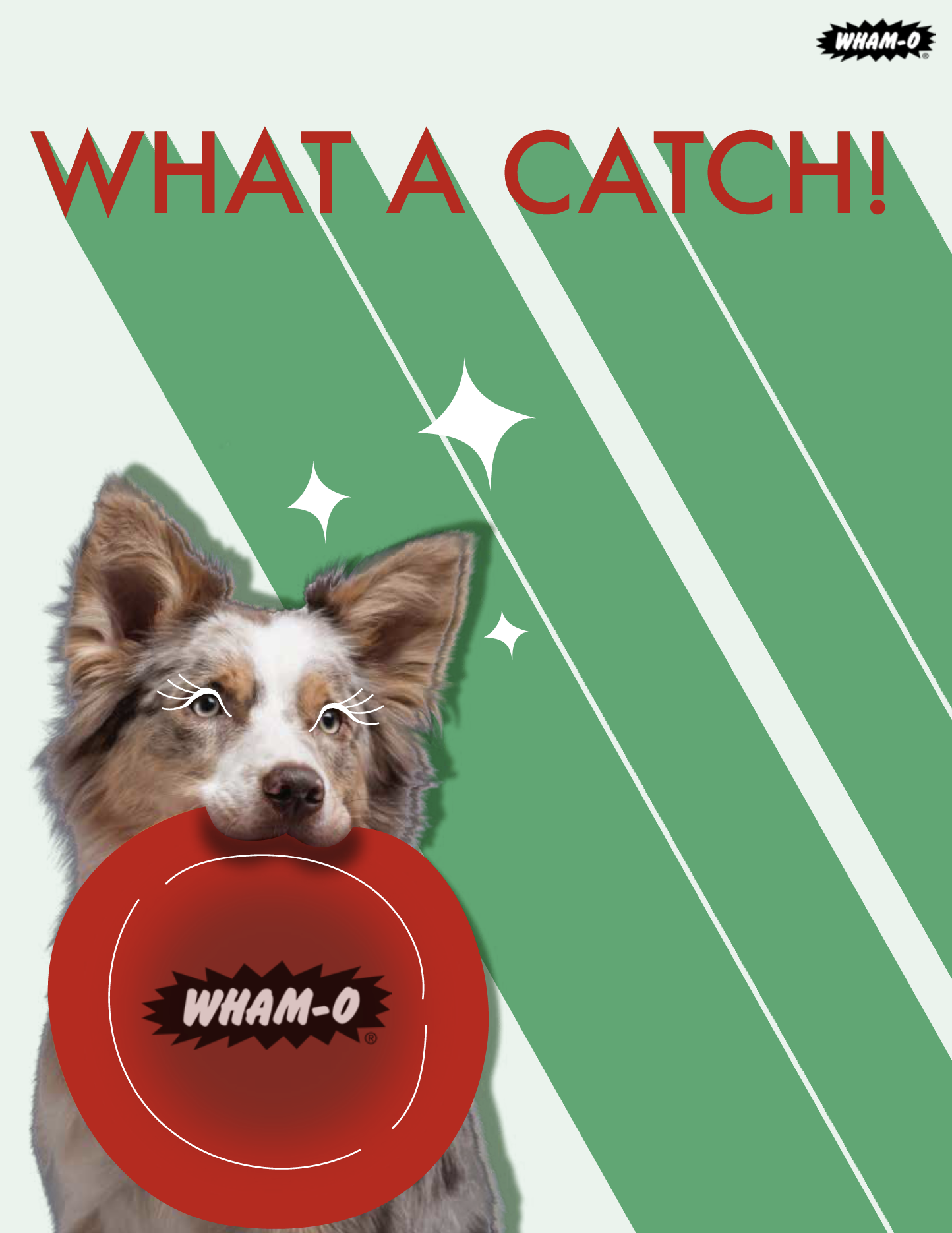
Beauty: I incorporated my illustrative style lightly in this Ad to accentuate typical or stereotypical standards of beauty expected in ads but with a dog. Reading the Ad one can interpret the dog to be the catch or take it as a compliment which is encouraged. Flattery tends to sell and our target audience are both pets and humans so it's an all around win.
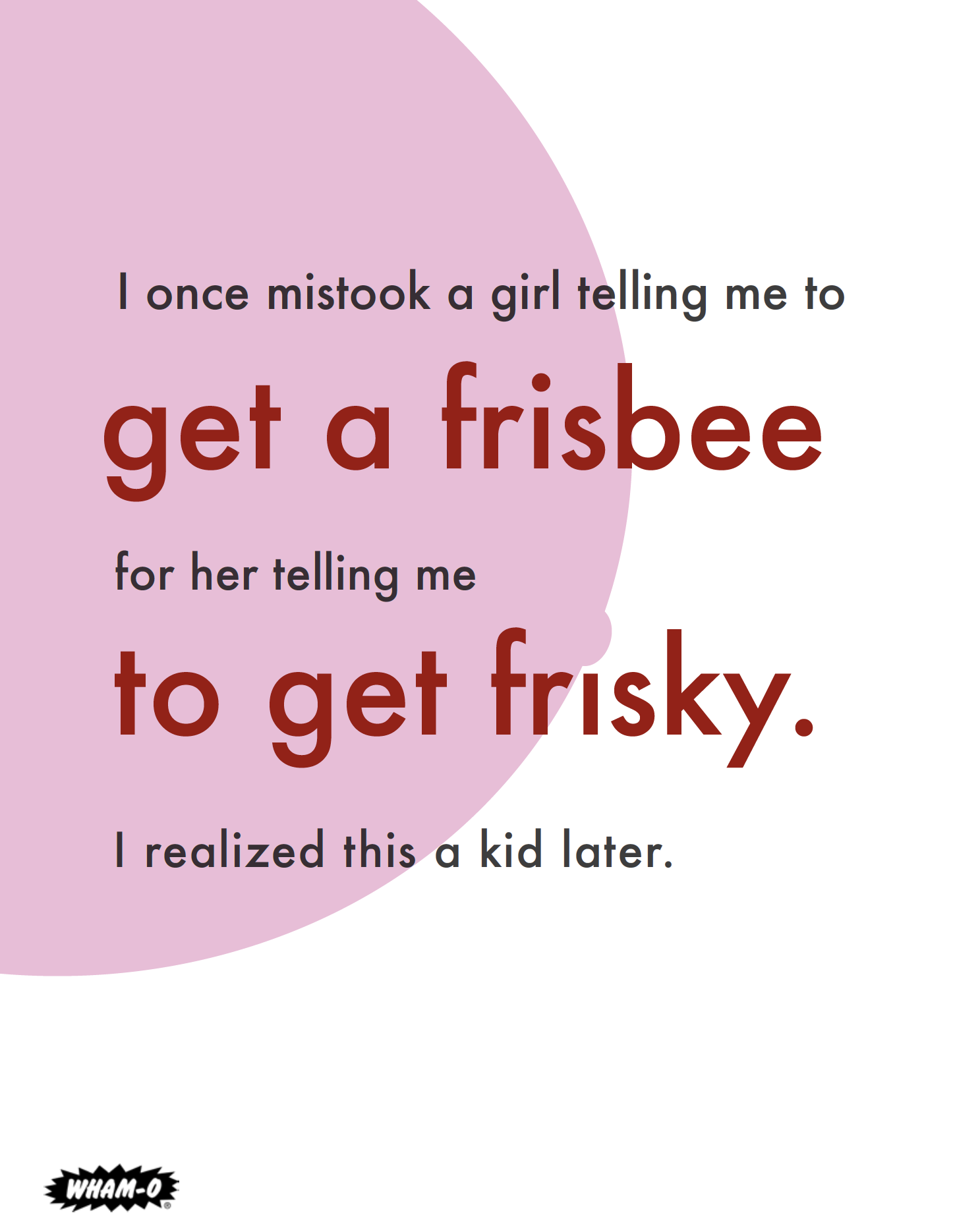
Words: This Ad was to only use words and could not rely on illustrations or photography. I use the weight and size of the text to guide the reader in between the lines. The Ad can be read from top to bottom and be presumed as a humorous AD but one can also read where the eyes gravitate to which is the red text to get a different message. The circle behind the text might not seem to be serving any other purpose but aesthetic but it in fact is an abstract visual cue of a pregnant stomach with the belly button being the dot on top of the “i” in the word frisbee.