
It’s more than a logo, it’s who they are.
I approach each logo design as an opportunity to encapsulate a company’s values and especially what makes them who they are neatly and creatively in the most strikingly and unforgettable manner.






Kiba K9 was a client based in New York. They service dog owners who seek dog behavioralists and training specialists. Kiba K9 prides themselves in the beautiful bonds they create between the dogs and their owners. They didn't have a logo so they took me on to design one for them. This is one example of the many presentations I gave the owner of the company while finalizing the design.
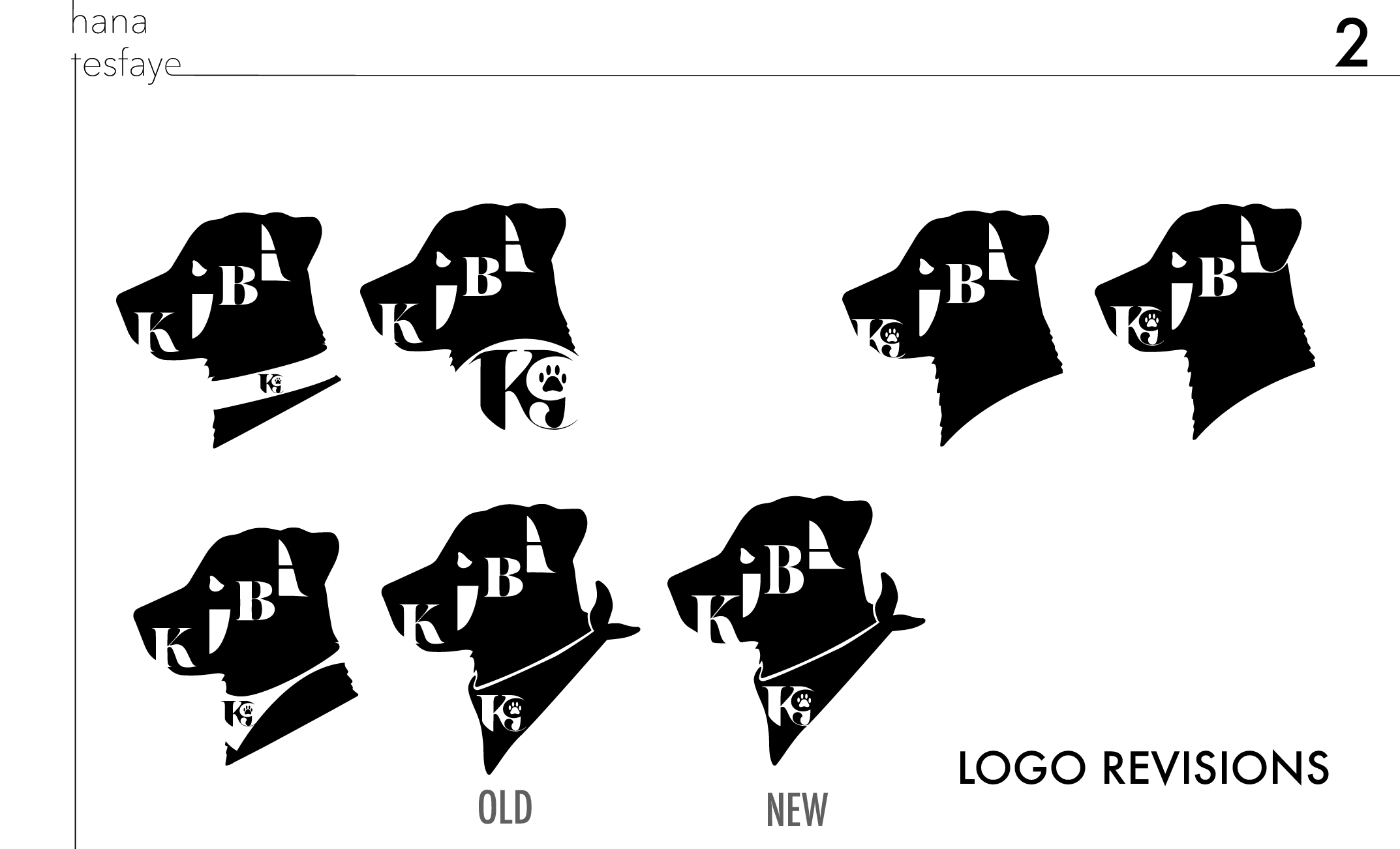
The first step in drafting logos is getting to know the client. Kiba and I had extensive conversations about his values what he wants the logo to represent. after doing 5 different types of logos he settled on this one. I then did even more iterations of just this style until he loved the results. There are subtleties in how the dog ears are suggested and the placement of the word "K9" in each of these.

Once he picked the logo he wanted I showed him a few wearables. This got the logo off of the screen and on to something he can more realistically imagine seeing the logo in such as merch or employee attire.

Another example of seeing it on a mocked-up website to visualize it both big and large to ext its readability at all sizes.
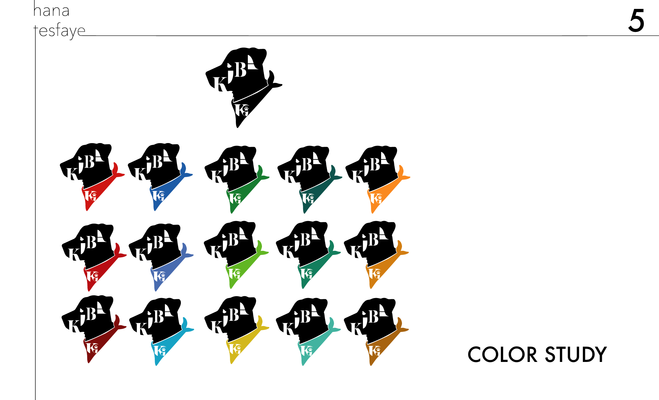
He wanted me to show him a few colors because he wasn't sure what color he wanted. He ended up with red. We both agreed red is a vibrant, energetic, and easily recognizable color that he wants to brand his whole company around.

I allow for more time at the end to digest everything I present to him, take, notes and prepare for the next meeting with all of his expectations met. Communication was key to the smooth collaboration we had!